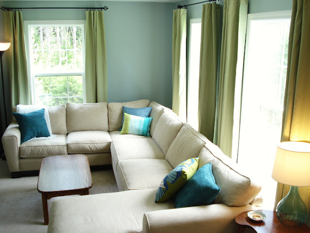
I'm back again today with some more about our living room. In case you forgot, here's what it's looking like:
One thing that's always bugged me about our house is that we have white trim, but the outlets and switches are off-white -- they just ended up looking dirty next to the white trim. So, while the furniture was out of the room and the outlet covers already off, we decided to take the opportunity to switch them out to white ones.
Yes, this is the living room wall. Isn't it crazy how much that blue color changes in different lights?
On Saturday, we picked up a couple boxes of tamper-resistant outlets and unbreakable nylon covers to replace the outlets, as well as some light switches and covers. The hubs did some research and managed to do the work himself (with the power turned off, always). He's so handy!
We went from this...
It was such a simple change, but it really makes a big difference. It makes the room look a lot more polished.
Before we moved the sectional back in, we also needed to hang the curtain rods. The curtain rods we had in there were left for us by the previous owner. Since I joined the home design blogosphere, I quickly learned the curtain "high and wide" mantra. Haven't heard of it? Here's the gist:
It took a while to get the hubs on board with this, but once I did, we quickly realized the curtain rods we inherited were not long enough to go as wide as we wanted. Determined to get this living room whipped back into shape, we made our second trip of the day to Home Depot for a few of these:
I wish we could say we used lots of scientific measurements to figure out the best high-and-wide placement, but we really just eyeballed it. They ended up being about eight inches from the top of the window frame and nine inches out on each side. The rods we bought were 48"-88" long.
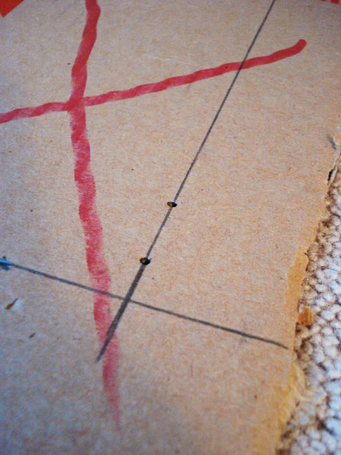
To make placing the brackets easier, we borrowed an idea from Miss Mustard Seed and made a template. We used an old piece of cardboard, cut off a corner so it would tuck around the window frame and measured where the screws should go.
Ignore the red lines
Then the hubs put the template against the wall and marked the holes.
This seemed like such a genius idea and worked great in the living room. Then we installed the brackets in the sitting room and ended up with this:
Hmm...how come they weren't even? It didn't take long to realize the problem was that our window frames weren't level. Bummer. We haven't decided how we're going to fix this one. So, if you go with a template, make sure your windows are level before you drill, and if they're not, adjust accordingly.
Anyways...hanging the curtains high and wide made SUCH a big difference! It makes the room look taller and opens up the windows to let in more light. I never disliked our old rods, but I'm really liking these ones a ton. They're thicker, so they're more substantial and give the windows a more polished look, if I do say so myself.
Curtains hung just above the window:
See what I mean?
High and wide, people! I'm a believer :)
And yes, those are the same curtains (they're from Target). I'm not sure about keeping them. Initially, I thought I'd get rid of them, but then we hung them up and, well, I'm not hating it. What do you all think? Is the blue and green combo a little too funky? Should I do with something with a pattern or more color? Or maybe just a plain white to keep things light and airy? I'd love to hear your suggestions!
One other little thing about the curtains. The problem with going high and wide can mean your curtains aren't long enough. These ones are only 84 inches long, so raising up the rods meant the curtains no longer hit the floor. But lucky for us, they're all hidden behind the furniture! (You can just barely see the bottom edge of the curtain on the left in that photo above.) So, we don't need to buy longer curtains. And it's better this way since the curtains no longer hang over the baseboards, meaning the heat should be more evenly distributed in the room.
We still have a few things to switch out in here. The coffee table is not staying -- it's too big for this space, and it was a hand-me-down, so we're not too sad to lose it. I'm not sure what we'll get instead. I've been thinking about one or two of these ottomans. I like the texture, that you can put things inside and that you could use them for extra seating or even move them out of the way easily.
And that floor lamp you see is from my old dorm room -- clearly, it's got to go! I can't wait to toss it and get something else. I've pondered getting one of these arc lamps and putting it in the corner behind the sectional, but I can't decide if it will just hang in your face and shine right in your eyes. But they are so cool-looking! This one's from Target.
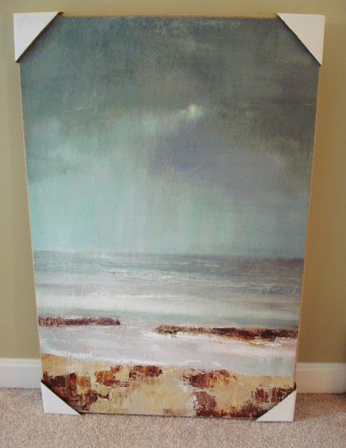
And then there's art. I'm not sure about everything that will go on the wall, but I do know I'll find a place for my new sunburst mirror...
...and this painting I got at HomeGoods...
Oh, I also have to show you my new side table. I got it for $70 from a local antique store. I just think it's so adorable. I wish I knew why it's shaped this way, if there's a reason for the cut-out in the front. Maybe it's just for aesthetics.
Anyways, I love the warm wood tones and I think the curves offset the boxy shape of the sectional. The detailing on the legs really gets me.
Okay, okay, just a couple more photos... :)

Now that this room is painted, maybe I can get back to that office redo I've been working on forever... :)


7 comments:
Mindy,
I love the shade of blue you used and I agree with the "high and wide"! I am going to give it a try with my living room curtains.
Doreen
It's so pretty! I love the green curtains with the blue walls... very serene and sea like. They really bring out the green in the pillows, too.
Your room looks great. I like the green curtains against the blue walls. The pillows tie it all together.
Beautiful! Personally I love the green and blue combo. I have been looking for a sectional like that for some time. Would you mind telling me where you got it?
Thanks!!
Thanks all!
Mel, the sectional is from Jordan's Furniture in Massachusetts -- they have stores in New Hampshire and Rhode Island too. It's made by Jonathan Louis -- you could check their website for a dealer that's close to you.
Oh my goodness, what I great color combo! I LOVE the paint color and the curtains together. So awesome.
Love the transformation. It looks beautiful and I love the green curtains!
Post a Comment