Hey all! Thanks for your nice words on my convex mirror and my new kitchen faucet! And a big HEY! to my new followers...I'm so glad to "see" you. :)
Waaay back in February, I posted about my first gallery wall.
After living with it for a few months, I decided I wanted to do it again -- bigger, better, faster, stronger! (Okay, not those last two...but the first ones, definitely!). And, after hemming and hawing over it, I decided I wanted to do white frames instead of wood-toned frames. As much as I love me some nice wood tones, our kitchen is full of wood (oak floors, those oft-mocked oak cabinets), and I thought some white would provide needed contrast and lighten things up.
(And no, I don't believe all frames in a gallery wall have to match, but that's how I like to roll!).
Once I decided on white frames, I popped over to Target. I'm super jealous, by the way, of all of you and your awesome Ikeas -- which, according to practically every blogger out there who's done a gallery wall, is the best place to buy frames in all kinds of sizes and for good prices. Sadly, the closest Ikea is three states away (I've never even been to one!), so I had to settle on Target. They don't have tons of options, but luckily the frames were on sale, so I grabbed a bunch. I gave a few of my wood frames a little white spray paint makeover too.
To decide on a layout, I traced my frames onto old wrapping paper, cut out the templates and did the ol' stick-'em-on-the-wall thing, moving them around until I got a layout I liked.
It was at this point that I informed the hubs of what I was doing. He squinted at it, and said, "Can I tell you my honest opinion?" Yikes! I was so afraid he was going to veto it, but he simply said, "All the frames should be the same color." Phew. I guess we're on the same wavelength!
Then came the tedious process of measuring, marking and hammering. Let's skip that boring stuff and see the final result!
Okay, now, before you say anything -- it's not quite done. I'm still working on a couple things to fill those two empty spots...
You'll just have to wait and see what goes there!
How about a little tour of what's in those frames? Not all of them are quite finalized, but they're good placeholders.
We've got a couple prints of two of my favorite places: Paris (a print I bought when I was there in 2005)...
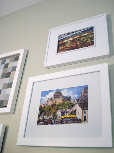
And one of Quebec, which I just bought this summer when the hubs and I went there for our anniversary. Above that is a photo I took while I was in France.
A postcard the hubs got from London, a cute beach photo and my DIY botanical art...
And some more free botanical art: I picked some fern leaves from my backyard, pressed them in books and framed them in these floating frames I had kicking around. Sadly, some of the fern leaves are turning brown, so these are likely placeholders until I find something better to fit those 10x10 frames. I thought about mounting them on paper, but I kind of like the green-on-green action.
Some new paint chip art I made. I like this one better than my first one (which you can see here).
A piece of seaweed I stole from the beach, all dried out and mounted onto cardstock...
Remember those zinc letters I bought earlier this summer? I love how they look mingled in with all these white frames.
Next to those, I channeled John and Sherry from Young House Love and framed the one-and-only photostrip of the hubs and me. It was totally random -- I found it while sorting through some old papers, and decided to use it as a placeholder. But I'm kind of liking it! If you don't know Young House Love (and how can you not?!), those two are all about the photostrips, and included a few in their hallway gallery.
To continue the lovey-dovey theme, I also printed out some lyrics to our first dance song ("All I Want Is You" by U2) onto a piece of tea-stained paper. Can I get a holla for free and sentimental art??
Another cheapo-art trick: The below print is actually the card advertising a new exhibit at an art gallery (the info is printed on the back). Popped in a frame, it looks like something I spent money on...but I didn't! (I totally wish I DID have the money to buy this artist's original work, but for now, this card will have to do).
And, that's what this is too. I prefer "frugal" to "cheap," thank you very much!
A couple more photos, just for funskis!
Did you spot the local art I actually DID buy? It's the leaf monotype in the center!
I didn't really have a theme when I was putting the art in, but I like all the greens, blues and grays, with an occasional pop of orange and yellow. But I'll probably switch out what's in some of the frames for new photos...it's only been up for a couple weeks and I'm already itching to see something new!
What do you think? I'm really digging it! I'd love to extend it even further and bring the frames down towards the floor, but for now I've got to put the funds towards something besides white frames, you know? Maybe someday I'll get to go to Ikea and buy some of those awesome ones all the other bloggers rave about!
And the requisite before-and-after shot...
You can see we decided to move that little bench thing (which, actually, IS from Ikea -- the only thing I've ever bought from Ikea, ordered online) into the dining room. I don't think it'll stay there, but it's currently holding our cookbooks, so it's nice to have those handy. It wasn't the right scale for this big wall, and it made this area feel a little cramped -- it leads from the entryway to the rest of the house, so openness is a must. (Too bad we have to stare at that baseboard unit though...).
Have you done a gallery wall, only to take it down and redo it a few months later -- or am I the only crazy one?
Linking up!


8 comments:
Mindy....please come help me do this in my family room...I will start picking out the pictures and pick up some frames!! I totally want this in my "new and improved" family room I am working on! Yay ...it so nice have a crafty daughter like you!! :)
Looks great. I adore that U2 song, good choice.
I am a big fan of a gallery wall, and I love the new look. The mix of all the different elements and pictures is perfect and the white frames brightens it up.
Wow, this art wall looks gorgeous. Love the seaweed too. So neat. And..., just thought I let you know. I included your lovely wire basket from Beach Grass in today's post.
I absolutely love it...all the colors make a statement. I'm so pinning you for when I get around to my gallery wall...hopefully sometime soon.
great color choice...LOVE the white frames. and btw, your hubby's a pretty smart catch. ;)
i would love for you to come link up this or any other amazing project at my creativity party going on right now!
letbirdzfly.blogspot.com
thanks so much for sharing!
I adore this wall - thanks for commenting on my kitchen wall - I would love to do something like this in my master bedroom or maybe family photos up our stairs - it looks wonderful
Thanks everyone! I know gallery walls are everywhere in blogland, but they are just so fun!
Post a Comment