First, a very big and heartfelt THANK YOU! to the sweet and supportive comments I received about my return to blogging. Seriously, I teared up. It never ceases to amaze me how supportive you out in blogland can be -- I appreciate it so much and I'm so happy to be back!
Okay, now to the couch. We've wanted to replace our two hand-me-down couches pretty much from the minute we moved into our house in October 2010. As I've mentioned before, they were in pretty rough shape -- both were sagging, one was held up by a piece of wood underneath the frame, the other padded with blankets and an egg crate to make it even remotely comfortable. The egg crate one was also slipcovered, and I HATED having to readjust that darn slipcover all the freakin' time for it to look presentable.
Sure, they don't look so bad here...they're tricking you
So, we wanted new furniture, but the problem? We had no idea what we wanted! Two couches, a couch and a loveseat, a couch and two armchairs, a couch and a (groan) recliner?? We went to a few furniture stores and came out discouraged. Finally, the weekend after Thanksgiving, we decided to hop in the car and drive to Jordan's Furniture in Reading, Mass., about two hours away.
Have any of you ever been to a Jordan's furniture? This place was insane! Not only were there like three floors of furniture, but there was also: an Imax theater, a TV store, a giant water fountain, a hamburger joint, an ice cream shop in the shape of a giant sundae, a trapeze school, and replicas of downtown Boston and the Red Sox mascot, Wally the Green Monster, made out of 25 million jelly beans. I kid you not.
There were signs everywhere telling people not to eat the jellybeans off the replicas, because they had been treated. Yuck.
You'd think that the furniture would be equally cheesy, but they had a surprisingly diverse collection. And after mocking up layout after layout of our living room, we realized the best thing to fit our space: a sectional. No, not one of those overstuffed, recliner-and-cupholder sectional (but if that's your thing, more power to ya!). We wanted something sleeker, more sophisticated, but still just as cozy. And after three hours of shopping (and a burger break, of course), we finally picked one by California company Jonathan Louis. This is our biggest house purchase to date, so we were excited but also nervous to pull the trigger.
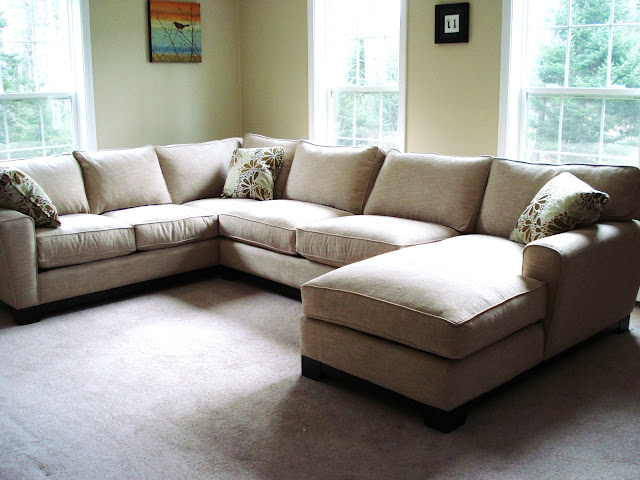
Our couch came a few weeks later. Check it out!
Whoa, it's huge!
The fabric is light, yes, but linen-like and sturdy (we were told). And it has a little variation, which should hopefully hide dirt. We paid a little more for extra-plush cushions.
So why did we pick a sectional? Well, we wanted more than one couch, because our living room is our only entertaining space, so we needed lots of seating for guests -- and since we practically live (ha!) in there, we always wanted lots of lounging space ('cause we're lazy like that). But squeezing two couches in that room meant they'd nearly overlap, and it also left a dead space in the corner that was hard to use (see the photo of our old couches above).
I tried to float the one couch-and-a-couple-chairs look, but the hubs wasn't feeling it. And he was really jonesing for a recliner, which made me less than thrilled -- I just have never seen a recliner I liked, and trying to position it with the space to fully extend meant putting it at a weird angle and practically in the way of the stairs, which just wasn't practical.
The sectional solves all our problems -- it wraps into the corner, so no dead space; it equals the lounging space of two couches without a weird overlap thing; and the chaise is just as good as a recliner, or so says my hubby. (When he conceded on the a chaise, I nearly fainted in happiness!) I just looove curling up on that chaise at night.
Don't you just love the free pillows that come with couches? *sarcasm*
We'll be upgrading our lamps and side tables too, and we definitely need a smaller (maybe a round?) coffee table -- or maybe none at all. We're contemplating an ottoman instead. I'll post about our plans for those later when we actually know what we want. :)
We are definitely loving the new couch. Our only problem? A beige overload.
Even with our curtains and other furniture back (we took them out so we could shampoo the carpet before the couch came), it still feels too blah to me.
I know some people really dig the neutral look, and I definitely love me some neutrals, but with the carpet, walls and big ol' sectional all nearly the same shade of beige, it's not really doing it for me.
We're contemplating painting (okay, I'm ready to grab a roller tomorrow!), but not sure what color. What do you all think? We want something light and bright, since we spend so much time in this room, but not too boring either. I'm picturing a light blueish color, but then I start remembering our bright-baby-blue kitchen when we moved in, and I get the heeby jeebies.
Nooo, not the baby blue!
But a color like one of these would be nice...
Benjamin Moore Wedgewood Gray
Source: Amanda Carol at Home via Involving Color
Sherwin Williams Sea Salt
Source: Unskinny Boppy via Involving Color
I was pretty sold on the blue until I saw this picture in the most recent Better Homes & Gardens
Total beige-on-beige action, and I like it! The hardwood and white carpet help break up the beige, though.If only we could put in hardwood! But that's for another
day year.
What do you think -- to paint or not to paint?


